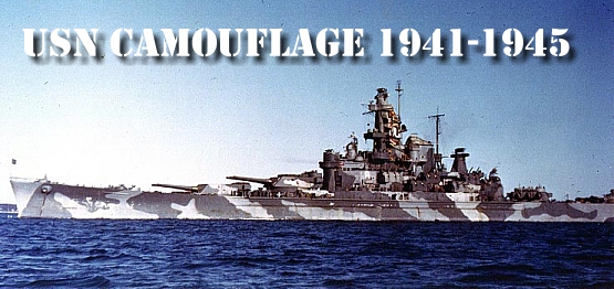
An online database of camouflage used by
United State Naval Warships during WWII
|
|
The
Development of Naval Camouflage 1914 – 1945
|
|
COLOR |
DATE
OF |
1929
MUNSELL NUMBER |
|
MS
1 |
1941 |
5PB
2.5/2 |
|
MS
2 |
1941 |
5PB
4.5/1.25 |
|
MS
3 |
1941 |
5BG
5.5/1.25 |
|
MS
4 |
1941 |
5GY
6/1.5 |
|
MS
4A |
1941 |
5BG
7.5/1.25 |
|
507A |
1920 |
5PB
3.5/2 |
|
507B |
1940 |
5PB
5.5/2 |
|
507C |
1920 |
5PB
7/1.5 |
|
Mountbatten
Pink (Light) |
1940 |
5RP
5/1.5 |
|
Mountbatten
Pink (Dark) |
1940 |
5RP
4/1 |
|
Western
Approaches Blue |
1941 |
5B
8/2 |
|
Western
Approaches Green |
1941 |
5G
7/6 |
|
Berwick
Blue |
1941 |
B
3/6 |
|
PB10 |
1940 |
7.5PB
1.5/6 |
|
B5 |
1941 |
10B
5/2 |
|
B6 |
1941 |
10B
6.2/2 |
|
G5 |
1942 |
5PB
2.8/1.5 |
|
G10 |
1942 |
5PB
3.5/1 |
|
B15 |
1942 |
7.5B
4/2 |
|
B20 |
1942 |
5B
5/2 |
|
G20 |
1942 |
5GY
5/1.8 |
|
B30 |
1942 |
GY-G
6/1.8 |
|
G45 |
1942 |
10Y
6.5/2 |
|
B55 |
1942 |
GY-G7.5/1.5 |
|
White |
1940 |
|
|
Dark
Brown |
1940 |
Unknown |
|
Light
Green |
1940 |
Unknown |
|
Stone |
1940 |
Unknown |
|
Black |
1940/41 |
|
|
Pink |
1941 |
R
7/2 |
|
Dark
Blue |
1941 |
B
4/6 |
NOTES ON COLORS
Berwick Blue - A dark PURE Blue
that utilized the Purkinje effect.
Purkinje Effect: A visual
phenomena with respect to the color blue. The Purkinje effect occurs where a
deep pure blue is present, and is the shift in the color sensitivity of the eye
with the change from light to dark adaption, the sensitivity of the eye for blue
light relative to the sensitivity to red light increasing very greatly with the
change from light to dark adaption. For example, in full sunlight a dark blue
will have approximately the same reflectance as a dark grey (about 10% ) but
under weak light, twilight, moonlight or less, the dark blue will appear as a
very light grey.
Dark Brown - No sample or
formula has been found. Description is based upon verbal reports, contemporary
watercolor paintings, and photos.
Light Green - As for Dark
Brown.
Pink - Taken from a color card
that was supplied by the Naval Establishment Paint Stores. The author had been
unable to establish its authenticity.
Stone – Description taken
from official document. Photos suggest a color of medium light tone.
Dark Blue - Description taken
from several verbal accounts and from official documents. These suggest that it
was a pure blue similar to Western Approaches Blue, but much darker.
Mountbatten Pink – Although
taken from Union Castle Lavender, Mountbatten Pink was noticeably different. For
actual Union Castle Lavender as worn by the American destroyer WINSLOW in late
1941, early 1942, see the l1SN color list (PSM 4/3).
HOW TO USE MUNSELL COLOR
REFERENCES
Readers wishing to view the
colors will have to obtain access to the Munsell Book of Color - 1929 edition.
Most large cities will hold this volume somewhere in their central library.
Numbers from the 1929 edition
have been used, because documents before World War II use the 1929 edition
numbers. Readers must NOT use any other edition of Munsell except the 1929 one.
In more recent editions the system was revised and the current color
numbers/values are NOT the same.
The Munsell Book of Colors
describes colors as being primarily composed of three facets or dimensions.
These are:
Hue = Color
Value = Degree of darkness or
lightness without regard to color.
Chroma = The. degree of color
saturation.
The Munsell number system is
therefore broken down as:
Official color 507A = 1929
Munsell SPB3.5/2 5PB = Midpoint in the purple blue range,
3.5 = Value = midway between 3
and 4 on the value scale.
2 = The. degree of chroma